Calculating NDVI: Part 2
This exercise follows on from the previous section. In the previous part of this exercise, you constructed a notebook to resample a year’s worth of Sentinel-2 data into quarterly time steps.
In this section, you will conitnue from where you ended in the previous exercise. Most of the code will remain unchanged, but we will introduce a new measurement to the existing measurements which will enable us to calculate and plot NDVI.
Note
We will be using the notebook we created in the previous section. If you have not already set up a copy of the notebook called Calculate_ndvi.ipynb with the required packages and functions, follow the instructions in previous section. Ensure you have completed all the steps, including loading the Sentinel-2 dataset.
Open and run notebook
If you are following directly on from the last section, you can skip this step. If you have closed your Sandbox browser tab or disconnected from the Internet between exercises, follow these steps to ensure correct package imports and connection to the datacube.
Navigate to the Training folder.
Double-click
Calculate_ndvi.ipynb. It will open in the Launcher.Select Kernel -> Restart Kernel and Clear All Outputs….
When prompted, select Restart.
Making changes to the load cell
Make the following changes below to modify the load cell.
Adding nir measurement
To calculate NDVI, we need to load Sentinel-2’s near-infrared band. In the Sandbox, it is called nir. To add the band, modify the load_ard cell according to the step below:
Add
nirto the measurements array.measurements = ['red', 'green', 'blue', 'nir']
If you completed the above step, your load_ard cell should look like:
sentinel_2_ds = load_ard(
    dc=dc,
    products=["s2_l2a"],
    x=x, y=y,
    time=("2019-01", "2019-12"),
    output_crs="EPSG:6933",
    measurements=['red', 'green', 'blue', 'nir'],
    resolution=(-10, 10),
    group_by='solar_day')
Running the notebook
Select Kernel -> Restart Kernel and Run All Cells….
When prompted, select Restart.
The notebook may take a little while to run. Check all the cells have run successfully with no error messages.
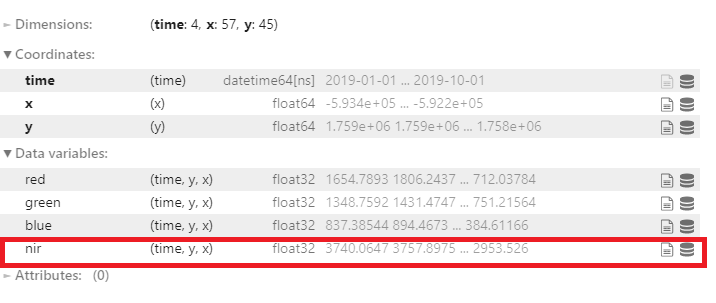
Did you noticed any additional data variables to the sentinel_2_ds?
Creating a new cell
After successfully running the notebook, this cell will be the last cell:
geomedian_resample
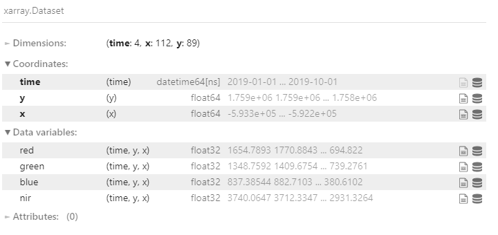
Notice it now contains the NIR band data, which is the data we just loaded.
Follow the steps below to create a new cell.
Make sure the last cell is selected.
Press the
Esckey, then follow it by pressing theBkey. A new cell will be created below the current cell.
Use the method above to create a new cell.
Calculate NDVI
One of the most commonly used remote sensing indices is the Normalised Difference Vegetation Index or NDVI. This index uses the ratio of the red and near-infrared (NIR) bands to identify live green vegetation. The formula for NDVI is:
When interpreting this index, high values indicate vegetation, and low values indicate soil or water.
Define NDVI formula
In a new cell, calculate the NDVI for the resampled geomedian dataset. To make it simpler, you can store the red and near-infrared bands in new variables, then calculate the NDVI using those variables, as shown below:
nir = geomedian_resample.nir
red = geomedian_resample.red

NDVI = (nir - red) / (nir + red)
Run the cell using Shift + Enter.
Plot NDVI for each geomedian
Our calculation is now stored in the NDVI variable. To visualise it, we can attach the .plot() method, which will give us an image of the NDVI for each geomedian in our dataset. We can then customise the plot by passing parameters to the .plot() method, as shown below:
NDVI.plot(col='time', vmin=-0.50, vmax=0.8, cmap='RdYlGn')
Run the cell using Shift + Enter
col='time'tells the plot that we want to display one image for each time step in our dataset.vmin=-0.50tells the plot to display all values below-0.50as the same colour. This can help keep contrast in the images (remember that NDVI can take values from -1 to 1).vmax=0.8tells the plot to display all values above0.8as the same colour. This can help keep contrast in the images (remember that NDVI can take values from -1 to 1).cmap='RdYlGn'tells the plot to display the NDVI values using a colour scale that ranges from red for low values to green for high values. This helps us because healthy vegetation shows up as green, and non-vegetation shows up as red.
If you implement the NDVI plotting code correctly, you should see the image below:
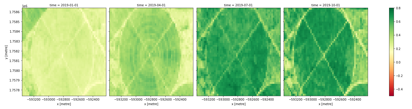
In the image above, vegetation shows up as green (NDVI > 0). Sand shows up as yellow (NDVI ~ 0) and water shows up as red (NDVI < 0).
Note
The xarray .plot() function is briefly described in Python basics 5: Xarray.
Plot time series of the NDVI area
While it is useful to see the NDVI values over the whole area in the plots above, it can sometimes be useful to calculate summary statistics, such as the mean NDVI for each geomedian. This can quickly reveal trends in vegetation health across time.
To calculate the mean NDVI, we can apply the .mean() method to our NDVI variable. We can also then apply the .plot() method to see the result, as shown below:
NDVI.mean(dim=['x', 'y']).plot(size=6)
Run the cell using Shift + Enter
NDVI.mean(dim=['x', 'y'])calculates the mean over all pixels, indicated bydim=['x', 'y']. To instead calculate the mean over all times, you would writedim=['time'].NDVI.mean(dim=['x', 'y']).plot(size=6)calculates the mean over all pixels, then plots the result. Thesize=6argument specifies the size of the plot.
If you implement the calculation and plotting code correctly, you should see the image below:
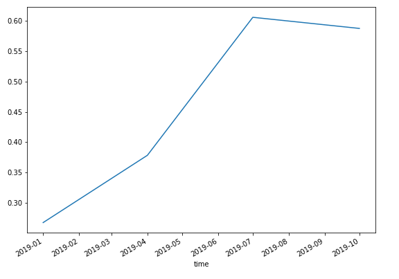
Rather than a spatial view of NDVI at each time step, we see a single value (the mean NDVI) for each time.
If you would like to add a title and y-axis label to this plot, you can add the following code below the command to calculate and plot the mean:
NDVI.mean(dim=['x', 'y']).plot(size=6)
plt.title('Quarterly Trend in NDVI')
plt.ylabel('Mean NDVI')
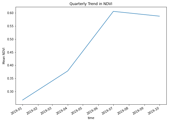
Run the cell using Shift + Enter.
Conclusion
Congratulations! You have successfully calculated and visualised the NDVI for a series of geomedian composite images.
If you’d like to experiment futher, try running the code with different areas. Did you learn anything interesting to share with us?